TAHU
Role
Product Designer
Year
2025
Platform
Web Dashboard
Tools
Figma, Miro
Description
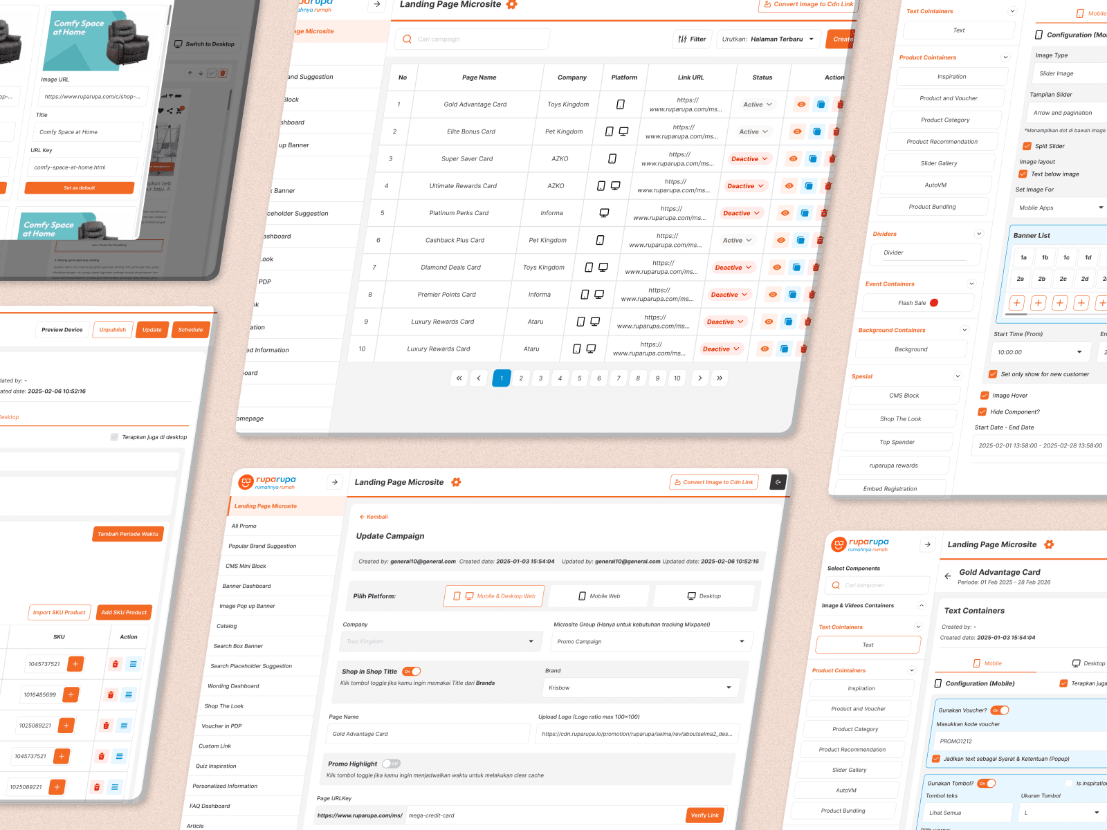
TAHU is a web-based dashboard built for a marketing team at an e-commerce company. It was designed to give non-technical users full control over the creation and management of marketing microsites, removing the dependency on engineering resources and allowing campaigns to move at the speed of the business. This was the second version of the dashboard. The first had been built entirely by engineers with no design involvement, and while it was functional, it lacked the structure, clarity, and usability that the marketing team needed to work efficiently. I came in to redesign it from the ground up.
Every time the marketing team needed to launch a microsite, they had to route the request through technical resources. This created a bottleneck that slowed down campaign execution, limited the team's flexibility, and stretched timelines beyond what a fast-moving e-commerce environment could afford.
The original version of TAHU was built without a designer. The engineering team had the right intentions, but the result was an interface that prioritized technical logic over user experience. The layout was difficult to navigate, information hierarchy was unclear, and the workflow did not reflect how the marketing team actually worked. The tool existed, but it was not truly usable.
The challenge was not just to build something new, but to take what was already there and redesign it in a way that finally made it work for the people it was meant to serve.
Research & Discovery
Since this was an internship project, the research phase was grounded in direct observation and internal context rather than formal methods. I spent time understanding how the marketing team currently operated, where requests got stuck, and what information they needed at each stage of a campaign. The existing dashboard also served as a reference point, making it easy to identify pain points through direct comparison.
Two key insights shaped the design direction. First, the team was capable and motivated but blocked by a tool that was never designed with them in mind. Second, the existing workflow had no single source of truth, making it difficult to track campaign status or manage multiple microsites at once. These findings made it clear that the solution needed to prioritize workflow clarity above all else.
Design Process
With a clear understanding of the problem, I reviewed the v1 dashboard in detail using Miro to audit what was not working and why. This became the foundation for all design decisions moving forward, giving me a concrete baseline to work against rather than starting from scratch without context.
From there I moved directly into high-fidelity design in Figma. Rather than going through wireframing stages, the design was built and refined iteratively, with layout decisions being tested and adjusted in real time as the interface took shape.
Three principles guided every decision throughout: clarity, scalability, and ease of use. The interface needed to be intuitive enough for a marketer with no technical background to use confidently, while also being structured enough to support the range and volume of microsites an e-commerce team manages over time.
Early in the project I worked closely with a mentor to align on direction and scope. As the project matured, I took on full ownership of the design, making independent decisions on layout, hierarchy, and interaction patterns.


Solution
TAHU v2 gives the marketing team a single, structured environment to create, manage, and monitor microsites directly from a web browser, without involving engineering at every step. The dashboard is built around a clear content creation workflow, with an interface hierarchy that surfaces the most important actions and information upfront.
The layout was redesigned from scratch to reduce cognitive load for users managing multiple campaigns at once. Information is organized so that status, progress, and next steps are immediately visible, allowing users to move through tasks quickly and with confidence. What had previously been a technically functional but difficult to use interface became one that the marketing team could navigate independently and efficiently.
The result was a measurable improvement in execution speed. By redesigning the workflow and optimizing the layout structure and information hierarchy, the project contributed to a 50% reduction in SLA, meaning campaigns that previously required significantly more time and coordination could now be launched in half the time.
Reflection
TAHU was the project where I experienced what it actually means to own a design end to end in a professional environment. Starting with guidance and gradually taking on full responsibility sharpened both my design judgment and my ability to make decisions independently under real business constraints.
Inheriting a product that had been built without design input was a valuable experience in itself. It reinforced how much layout, hierarchy, and interaction clarity matter, not as aesthetic choices, but as functional ones that directly affect how well a team can do their job.
The most important lesson was that good dashboard design is not about adding features. It is about understanding the workflow deeply enough to remove friction from it. Every layout decision, every label, and every layer of information hierarchy was in service of one goal: helping a non-technical user move faster and with more confidence.
